One of our new prints for the season is Winter Fruit. The development of this print took some time and many iterations to come to the final version and is a great example of how the creative process is often not very straight forward.
As we were developing the look and feel for our Winter collection, Clover, I was very much drawn to large, loose hand-drawn graphics and placement prints. My mood board started to be peppered with these images of tablescapes or artworks that had a very organic, illustrative vibe.

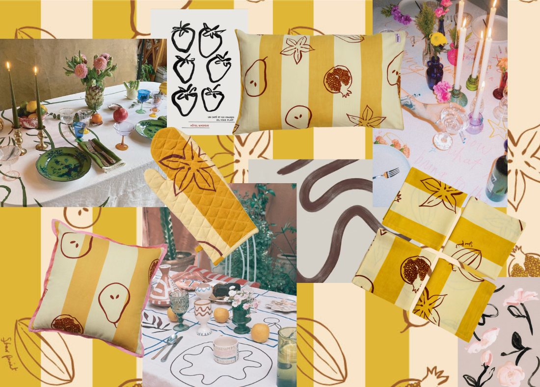
Winter Fruit Moodboard
I took these images and colour references and started to draw in black ink as usual which started with a lot of abstract scribbled elements, before scanning them into Photoshop and starting with colour experimentation. The print started off quite colourful and messy then gradually became more refined through the stages of development. This print really started with tableware in mind, and I was imagining the space for this print to be quite grand – a big table in a space with lots of natural textures and dark woods. Rather luxe, and a little bit Euro at the same time.

Initial iteration of what later became Winter Fruit
At this stage of the development, I felt that the scribbles were maybe a little too loose and messy, so changed direction and chose winter fruits as a subject. I drew big, oversized shapes with loose lines, picturing messy dinner tables strewn with candles, giant pears as décor and handwriting on the tablecloth.

Ink sketches
As with everything, it took a while to reach the final stage in terms of placement and colour. During the development stages, I knew I wanted to include brown in the print as it felt very wintery, rich and luxurious for the season and the warm vibe we were trying to achieve. However, knowing that brown can be a polarizing colour for people, I chose to just make the line drawings and text in brown, so it didn’t feel overwhelming, instead opting for a yellow ochre and cream bold stripe as the background of the print. I feel like the stripe grounds the print on the fabric and brings another design element to it.

Playing with colour combinations
We decided to take the print from tableware and trial it in bedding and accessories, and I think it’s particularly successful in the Quilted Throw and matching pillowcases. It just adds an instant layer of warmth to the bedroom, and its earthy tones complement so many different bedding palettes, especially our Seersucker Stripe and Mango Seersucker iterations.

As usual all our designs are designed to go over all seasons and I feel like this print emulates an Italian summer vibe as well. I can picture it as the beautiful backdrop for long lunches in the sun or balmy summer nights.

Leave a comment
This site is protected by hCaptcha and the hCaptcha Privacy Policy and Terms of Service apply.